Are you looking to improve the user experience on your e-commerce site and boost conversion rates? Then it’s essential to pay attention to the design of your intermediary category pages. These pages play a critical role in helping users navigate your site and find the products they need, but if subcategories aren’t easily accessible, users can get lost and overlook suitable products.
So, what’s the solution? Prioritizing subcategories on intermediary category pages is key for faster navigation and better user experience. By featuring subcategories at the top of the page above auxiliary content, users can quickly get an overview of all the subcategories available and assess the scope of the category and how product subtypes differ. Our research findings show that when subcategories take center stage on intermediary category pages, users are more likely to find what they need without getting distracted from their original tasks.
But why stop at subcategories? Displaying sub-subcategories on intermediary category pages can further promote deeper navigation paths. This allows users to quickly get into a narrower scope and saves them time, especially if they already have a clear idea of where they need to go. During testing, savvy participants used sub-subcategory links as direct deep links, skipping one level of the site hierarchy and saving time.
However, it’s crucial to ensure that subcategories and sub-subcategories are presented in a visually clear and organized way. Mixing featured products with subcategory thumbnails should be avoided, and featured products should be secondary to subcategories. Prioritizing subcategories ensures clear and easy access to them and makes the page easily identifiable as an intermediary category page. Furthermore, any featured filter-based paths, products, help, and inspirational content should be presented in a secondary manner.
In conclusion, intermediary category pages can significantly impact user experience and conversion rates. By prioritizing subcategories and displaying sub-subcategories when appropriate, you can make navigation on your e-commerce site faster and more intuitive, leading to higher customer satisfaction and more sales.
Good Implementation Example:
Build.com (Mobile)
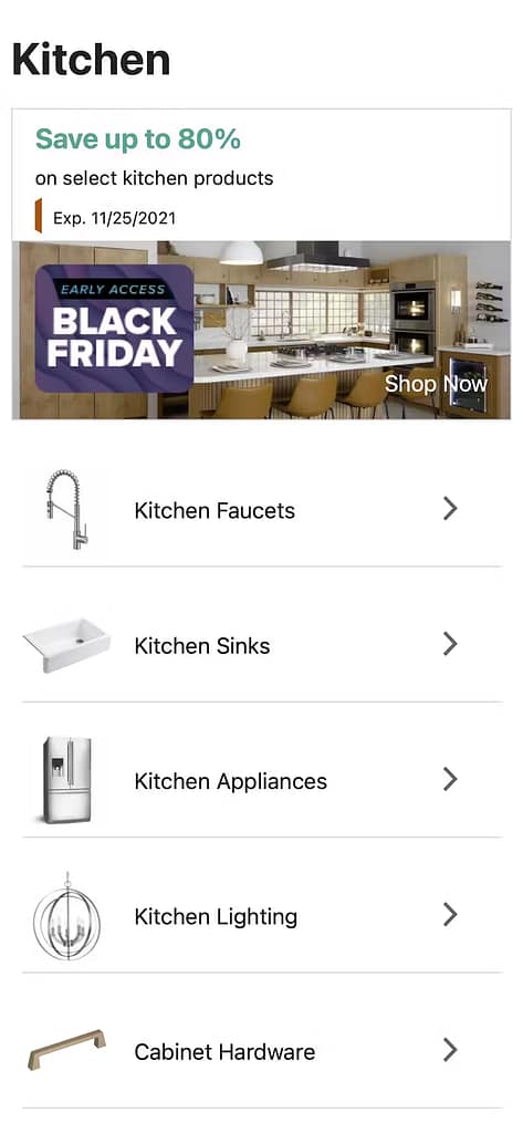
[Build.com](http://build.com/)’s 2021 implementation presents subcategories at the top of intermediary category pages.
Placing subcategories as the primary content on these pages allows users to easily find and navigate to the desired category without being distracted by promotional or auxiliary content.
This approach is beneficial as it helps users get an overview of what is available and make informed decisions among subcategories.

Other companies with good implementation of subcategories as the primary content on intermediary category pages include Cabela’s, Power.dk, Northern Tool, and B&H
Bad Implementations Example:
Ellos (Mobile)
Ellos’ 2022 implementation is not featuring subcategories as the primary content at the top of the category page.
The lack of prioritization of subcategories on intermediary category pages can cause users to become distracted from their original task by promotional or auxiliary content placed above subcategory navigation.
In addition, mixing subcategory thumbnails with featured product thumbnails can cause confusion for users who may mistake subcategory thumbnails for specific products.
To improve UX, it is recommended to prioritize subcategories on intermediary category pages by featuring them front and center at the top of the page.

Other companies with bad implementation of subcategories on intermediary category pages include Argos (UK), HP, Gilt, and John Lewis.
Key Learnings - InsightLens
- On intermediary category pages, subcategories should be the primary content featured above auxiliary content such as inspirational imagery, promotions, and ads.
- When subcategories are not immediately accessible on intermediary category pages, users may struggle to identify them as intermediary category pages at all and find it difficult to navigate to suitable products.
- Subcategories should be prioritized over featured products and should not be mixed with them or interspersed with ads and promotional content.
- Subcategories should be presented in a visually dominant manner and should be located front and center at the top of the page on desktop sites.
- Displaying sub-subcategories on intermediary category pages can promote deeper navigation paths and benefit both users who are uncertain which subcategory to choose and those who have a clear idea of where they need to go.
- While displaying sub-subcategories is beneficial on desktop sites, it may not be feasible on mobile sites due to limited screen real estate, and subcategory thumbnails and labels may be the best option for users on mobile intermediary category pages.


