Designing a user-friendly and efficient checkout process is a critical aspect of any online business. Ensuring that the primary button, also called Call-To-Action (CTA) is styled in a unique way, consistently placed, and descriptively named can significantly impact the overall user experience (UX) and ultimately increase conversions.
The main CTA is the button that users click on to proceed to the next step in the checkout process or to complete the primary action on the step. It is important to note that users often rely on visual cues rather than reading the microcopy to determine which button is the primary button. This means that if the primary button’s visual design does not match the importance of its function, users may misinterpret it and cause confusion.
To avoid this confusion, the primary Call-To-Action should stand out from the other buttons on the page. This can be achieved by giving it a unique design, consistent placement, and dynamic microcopy that clarifies the unique path or action the primary button represents. The goal is to make the primary button easily distinguishable from the other buttons on the page so that users can quickly skim the checkout step and understand how to proceed in the checkout flow.
The visual styling of the primary button is critical in making it stand out. It is essential to give the primary button a unique design that is not reused for other buttons on the interface. Using the same color or styling for all buttons on the site will make it almost impossible for the primary button to stand out without excessive tweaking of font styling or size.
Consistent placement of primary buttons is also important to help users identify and distinguish the primary button. Inconsistent placement of primary buttons can cause confusion, and users may overlook the button and assume that their desired action isn’t available. A consistent placement throughout the checkout is critical in helping users navigate the checkout process more efficiently.
Additionally, the microcopy on the primary button should be clear and descriptive, helping users quickly determine its function. Unclear or incorrect microcopy on primary buttons can slow users down, just like inadequately highlighted buttons. Personalizing the button microcopy to the user’s context is key for clarity.
In conclusion, designing a user-friendly and efficient checkout process is crucial for online businesses. By ensuring that the primary button is styled in a unique way, consistently placed, and descriptively named, businesses can significantly improve the user experience and ultimately increase conversions. The primary button’s visual styling, consistent placement, and descriptive microcopy are critical in helping users navigate the checkout process more efficiently.
Good Implementation Example:
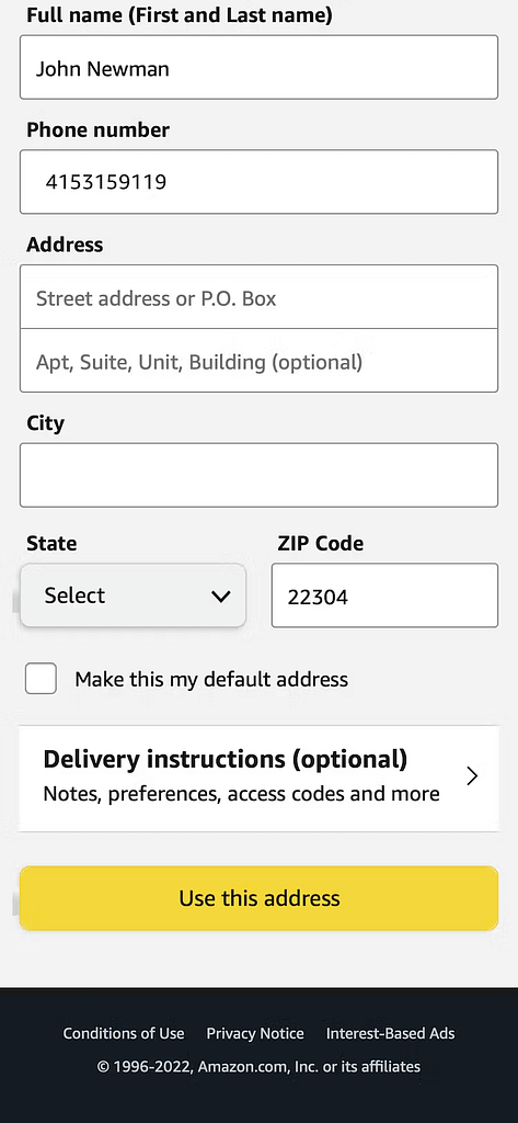
1. Amazon (Mobile)
Amazon’s checkout flow is a great example of a good implementation of primary buttons. The “Place your order” button is prominently displayed in a contrasting color, making it easy to spot and understand its function. The button is consistently placed at the bottom of the page throughout the checkout flow, and the microcopy is descriptive and accurately reflects the action the user is taking.

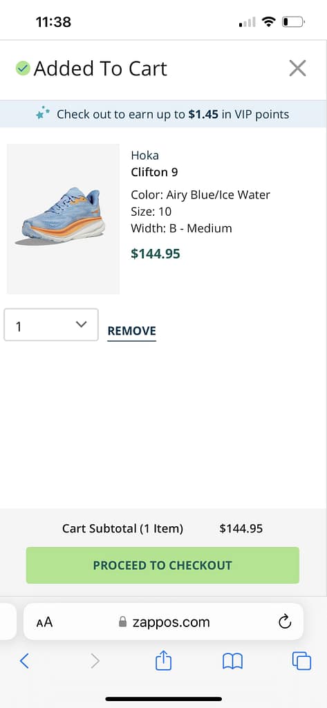
2. Zappos (Mobile)
Zappos’ checkout flow is another great example of a good implementation of primary buttons. The “Place your order” button is prominently displayed in a contrasting color, making it easy to spot and understand its function. The button is consistently placed at the bottom of the page throughout the checkout flow, and the microcopy is descriptive and accurately reflects the action the user is taking.

Bad Implementations Example:
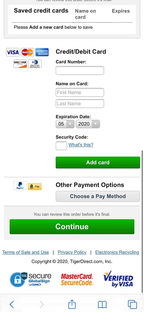
1. TigerDirect (Mobile)
This implementation by TigerDirect demonstrates poor user experience (UX) based on the following factors:
- Inconsistent Styling: The overlay in TigerDirect’s ‘Payment’ implementation violates the guideline by styling clearly secondary actions as primary buttons. This inconsistency in button styling can confuse users, as they rely on visual cues to determine the importance of buttons. If secondary actions are visually treated as primary buttons, users may misunderstand the intended actions and make incorrect choices, leading to frustration and a negative UX.
- Importance-Function Mismatch: As mentioned in the guideline, users often rely on visual cues rather than reading button microcopy to determine the primary button. If the visual design of the button doesn’t accurately represent the importance of its function, it can lead to confusion and usability issues. In TigerDirect’s implementation, if secondary actions are visually treated as primary buttons, users may mistakenly perceive them as the main course of action, potentially causing errors or disruptions in the user flow.

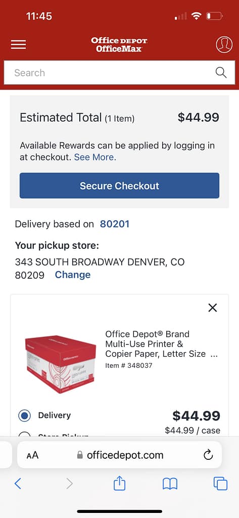
2. Office Depot (Mobile)
Office Depot’s checkout flow is another example of a bad implementation of primary buttons. The button microcopy is unclear and doesn’t accurately reflect the action the user is taking. The placement of the button is inconsistent throughout the checkout flow, which can cause confusion for users.

Key Learnings - InsightLens
- Users often rely on visual cues instead of reading button microcopy to determine the primary button, which can lead to confusion and errors during checkout.
- To make the primary button noticeable, it should have a unique design, be consistently placed, and have descriptive microcopy that clarifies its unique action.
- The primary button is critical for fast and efficient checkouts, and it should stand out from surrounding buttons, logos, or images to be seen by users.
- Consistent placement of primary buttons throughout the checkout flow is crucial to help users identify and distinguish the primary button and avoid site abandonment.
- The primary button’s microcopy should be clearly written and match its action or path to avoid confusion and guessing by users.
- Multiple “primary” buttons with different functions should generally be avoided, but two primary buttons with the same function at the top and bottom of the step are fine.
- Ensuring unique styling, sufficient prominence, consistent placement, and descriptive microcopy for primary buttons is a low-cost way to improve checkouts for users, but 48% of sites still get one or more requirements wrong when designing primary buttons for checkout.
- A simple test to gauge if a primary button is sufficiently prominent is to replace all microcopy on all buttons in the checkout flow with the same nonsense word and see if it’s still obvious which button is the primary button.


